Grocery stores are literally designed to make you spend as much money as possible. You could even wind up in credit card debt if you’re not careful. We’ve shared several tips to save money on groceries in the past, but it’s important to see how the store’s floor plan alone can tempt you to pad your grocery bill.
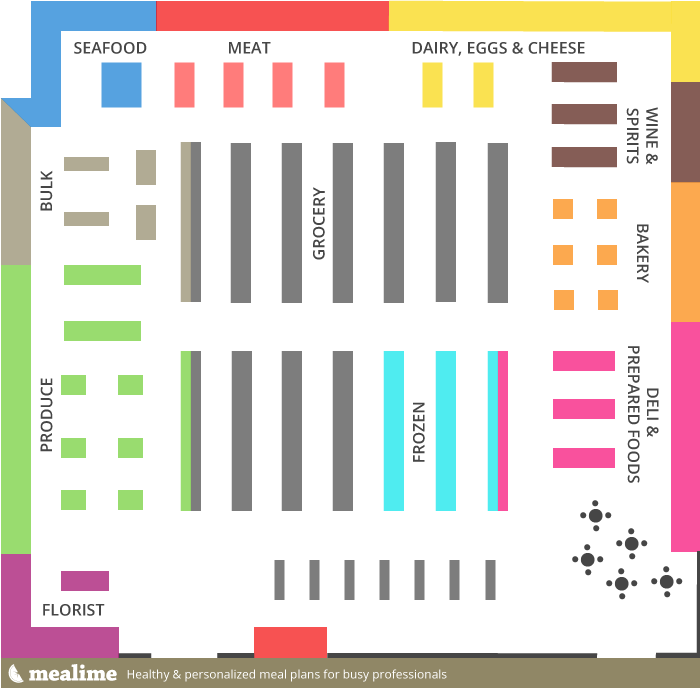
If you’ve never seen it before, here is the typical layout of a grocery store. Not all stores will be exactly the same, but most will follow this basic principle.
Grocery Store Layout
You’ll notice that the more common “staple” items are placed around the perimeter of the store, like dairy, meat, deli, bread, and produce. Stores are designed this way to prompt you to walk across and/or around the entire store to find the things you need. Why? So that you will find additional “extra” items along the way. Those lie in the grey areas on the map. Here is where you’ll find things like cereal, juice, chips, snacks, soda, canned goods, and everything else. But buying extra things can derail your debt management progress. Avoid if you’re trying not to overspend!
It’s rare that you’ll be able to avoid the grey areas altogether. You’re bound to have something on your list in that section. The key is to stick to the outer edges as much as possible, and don’t linger or browse in the middle aisles. That’s how you wind up placing extra items in your cart, and increasing your grocery bill. Stick to your list and you should be fine.
If you’re struggling to pay off debt, ACCC can help. Schedule a free credit counseling session with us today.


